Integrative Conservation Clinic | collaboration for conservation

Improving how conservation professionals access, share, and apply environmental knowledge.
Project Type: UX/UI Platform design
Role: UX/UI Design, UX research
Industry: Conservation, Social
Tools: Figma, Notion, Illustrator, Zoom
Methods: User interviews, personas, low- and mid-fidelity prototyping, think-aloud usability testing, interactive testing, A/B testing
The Overview
The Integrative Conservation Clinic was a six month initiative to bridge the gap between academic theory and environmental action. The challenge was a systemic one. Conservation platforms are often overcrowded with text-heavy information, making it difficult for professionals to find original content. Most information is disciplinary focused, which prevents researchers from understanding perspectives outside their specific niche.
Technical Constraints and Environmental Adjustments
Connectivity Gaps: Field coordinators noted that they often lack reliable internet at remote research sites. To make digital resources useful in the field, I integrated direct PDF generation and print-ready formatting. This ensures verified studies and toolkits are available even when mobile data is not.
Simplifying for the User: The platform serves a wide range of people, including older volunteers who find crowded layouts difficult to use. I adjusted the visual hierarchy with larger text and plenty of white space to make the pages easier to scan. This keeps the data legible regardless of a user's technical experience or the lighting in their environment.
Verification Logic: Since data accuracy is a professional requirement, I designed a peer-review system. This allows experts to verify content, turning the site into a trusted resource for researchers and regulators rather than just a passive library.

Pivot: From Academic Silos → User Intent
The original plan was to organize the platform by academic subjects like biology or sociology. However, interviews and card sorting exercises showed that professionals do not work in confined disciplines, they work toward specific outcomes. Research showed that users search based on what they need to do next, such as finding a tool or understanding a broad method.
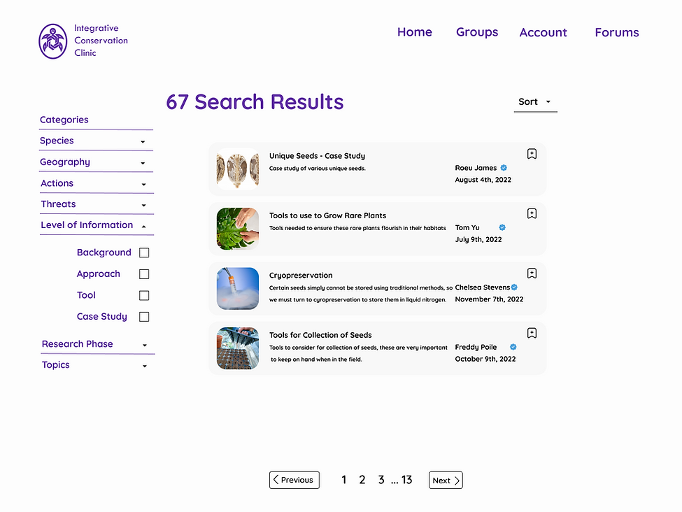
This led to a shift toward the BATs framework. This model organizes information into four layers based on user intent:
Background: The foundational theory and context.
Approach: Broad methods and strategies.
Tools: Practical, actionable resources.
Case Studies: Real world examples that link the other three layers together.
The Trade-off
I wrestled with the decision to simplify the academic categories. I was originally worried that losing that technical precision might frustrate some experts, but my testing showed it was actually the right call. Users felt much more confident exploring topics outside their usual wheelhouse when the structure was built around what they were trying to do, rather than just their job title.
Clarifying Community Participation
Testing showed that users were often confused about how to participate socially. Many were unsure where to post or share findings, often choosing to stay silent to avoid making mistakes in a professional setting.
To address this, I helped reorganize the community features into two clear paths:
-
Groups for focused collaboration.
-
Forums for broader discussion.
Clearer labelling and distinct entry points helped users build a more accurate mental model of exactly where their contributions belonged, reducing the friction of joining the conversation.


Testing & Iteration
I began with think aloud usability testing on low fidelity prototypes to track task success and identify specific confusion points. While the broad navigation worked well, these early sessions revealed that users struggled with bookmarking and moving between different research layers.
Later, I conducted interactive testing across five core tasks, including searching for information and saving content for offline use. While users could complete every task in under three clicks, the testing showed that search behaviour and social features still required further refinement to feel intuitive.
To validate my iterations, I ran A/B tests between different prototype versions.
I presented this finding directly to the client during the final presentation. Rather than just reporting on usability, I provided recommendations on how to differentiate the platform by focusing on its unique value: curated credibility and specialized tools that general search engines cannot replicate.
Accessibility
Accessibility was integrated into the design process from the start rather than being treated as a final checklist. I focused on reducing text density and sharpening the visual hierarchy to make information easier to scan.
To make the platform more inclusive and functional in the field, I contributed to several key decisions:
-
Guest Access: Allowing users to find and use resources without mandatory account creation.
-
Audio-Based Content: Providing alternatives to text for users who may be multitasking or in low-visibility environments.
-
Reduced Density: Controlling information flow to support users with different cognitive needs or those working under high-pressure conditions.
These choices weren't just about compliance; they were direct responses to user feedback and the diverse environments where conservationists actually work.
Outcome
The final design uses "Calm Technology" to respect the professional’s time. By layering information through the BATs framework, a researcher looking for a specific tool can skip the theory, while a student can start with the basics.
40% Faster Search: Moving to intent driven categories helped users find specific tools much faster than a standard keyword search.
The 3-Click Rule: Final testing confirmed that all primary tasks, from finding seed data to reporting findings, could be finished in three clicks or fewer.
Reflection & Next Steps
This project reinforced that in complex, interdisciplinary fields, designing for confidence is just as important as designing for access. It emphasized the value of grounding every design decision in research and validating those choices through testing rather than relying on assumptions about how experts "should" work.
With additional time, I would focus on the following next steps:
-
Longitudinal Testing: Measuring repeat usage over several months to see how well the platform supports long term professional workflows.
-
Terminology Validation: Further validating specialized labels and terms across different disciplines to ensure the language remains inclusive and accurate for all users.
-
Personalization: Exploring deeper personalization features based on user behaviour to help practitioners surface relevant research and tools more efficiently.